Configurable Dashboards
Multi-User Project Management
Dashboards and Widgets
Role
Lead Product Designer
Timeframe
6 months
Impact
Active Dashboard Engagement
Session Dwell Time
Team
Product Manager
Project Manager
Business Analyst
Front-End Engineers
Back-End Engineers
Problem
The Same Dashboard for Everyone
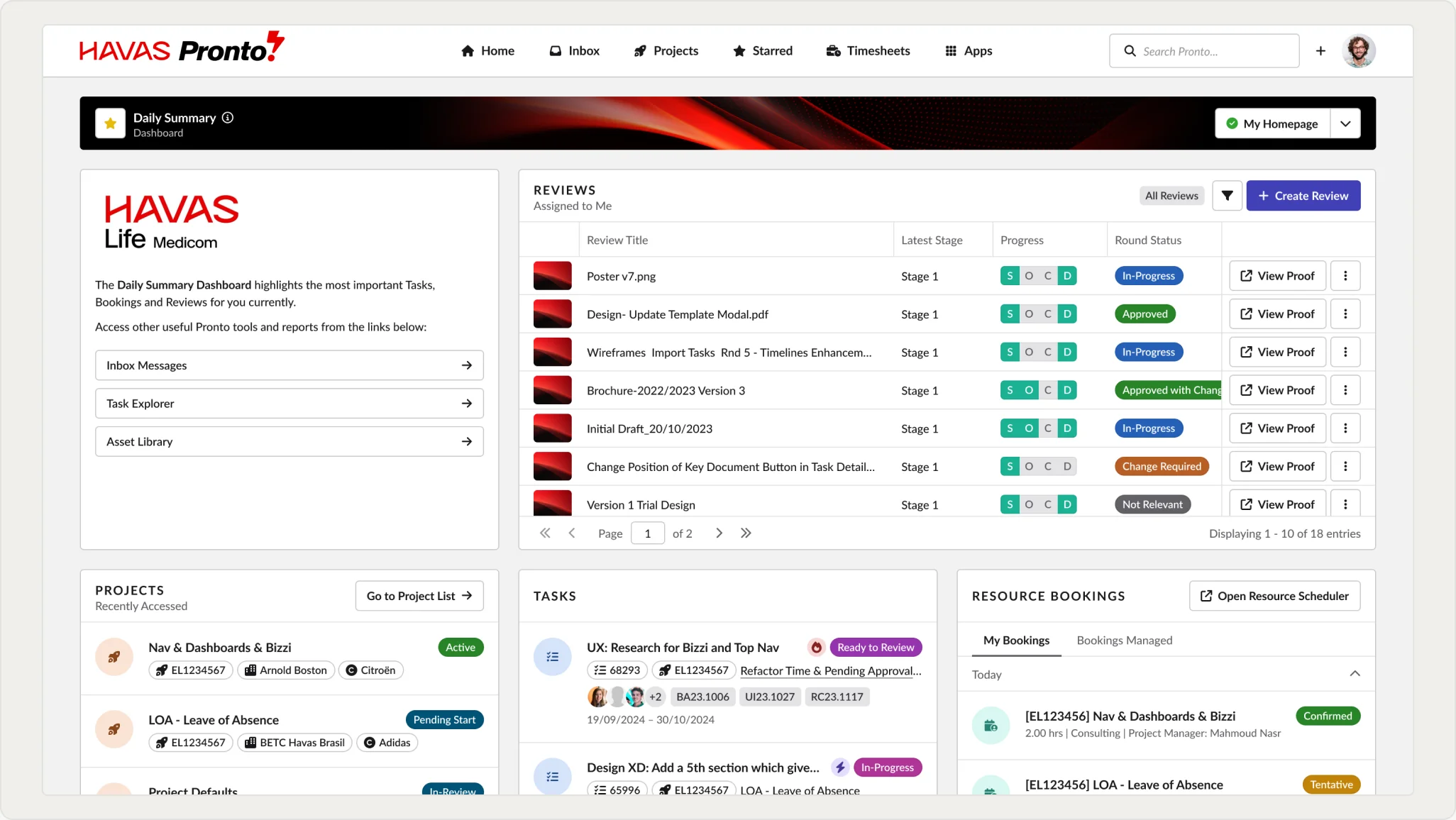
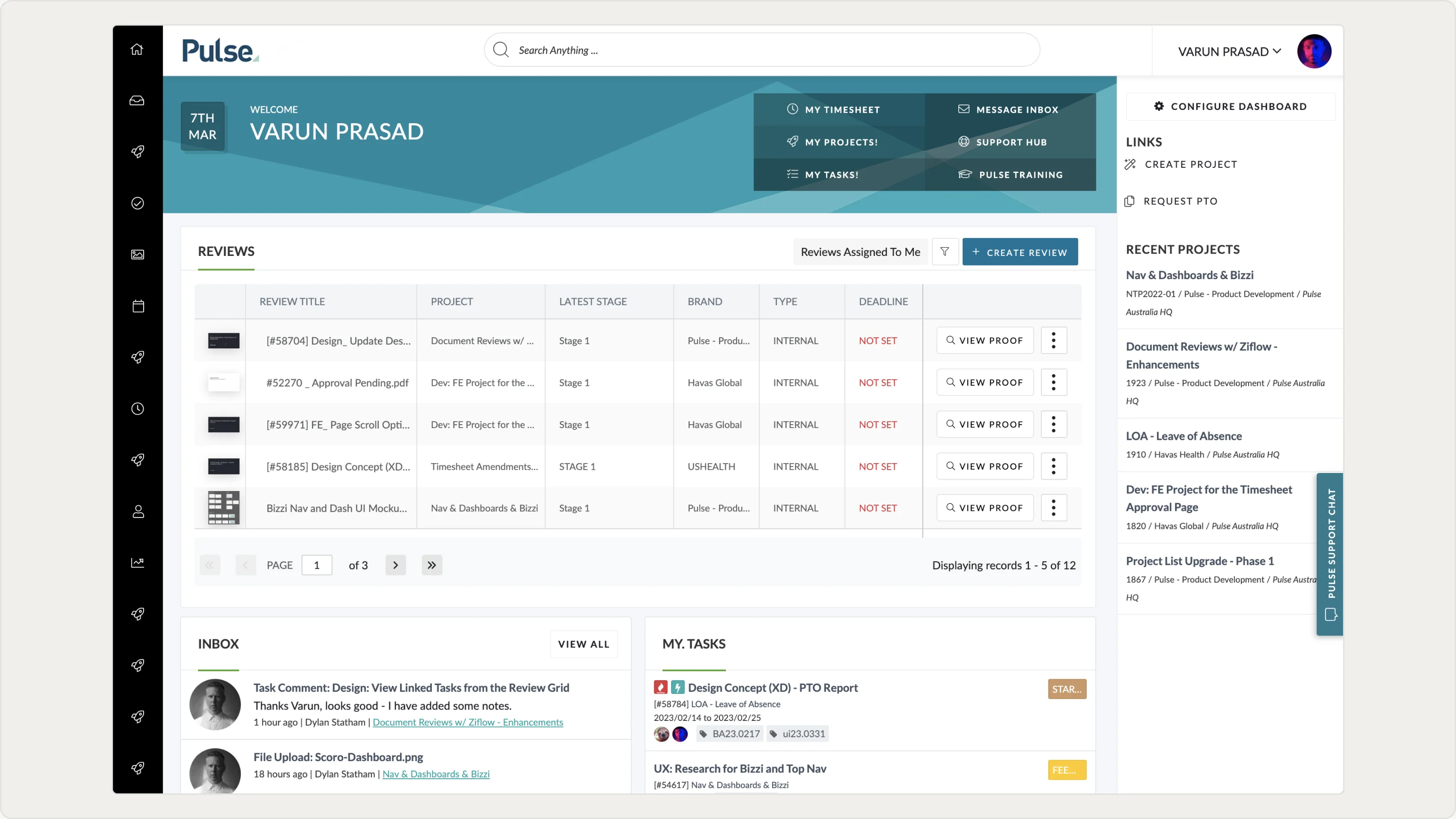
The dashboard is the first screen every user lands on after login, meant to update them on their projects at a glance and act as a springboard into deeper areas. Its static, generic layout ignored the logged-in user's role and usage pattern, resulting in low engagement. This work coincided with moving the navigation to the top, as well as a full rebrand.
Discovery
What the Usage Data Actually Showed
Engagement analytics showed which widgets users interacted with versus which they ignored, and support tickets flagged people rebuilding the same information elsewhere because the dashboard did not surface it for them. The pattern was consistent: the generic layout was not wrong for everyone, it was optimal for no one.
Competitor Analysis
What the Market Already Solved
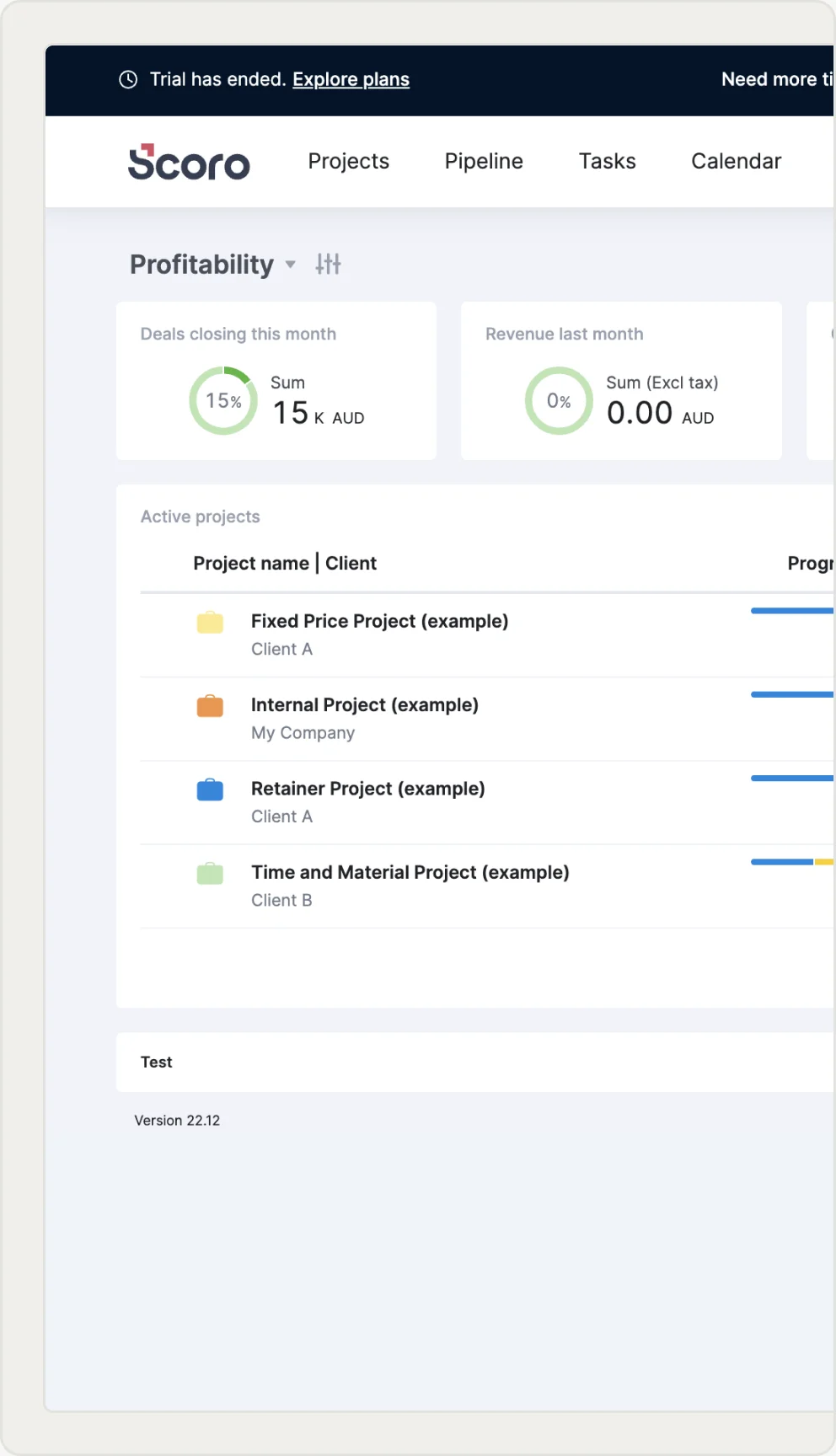
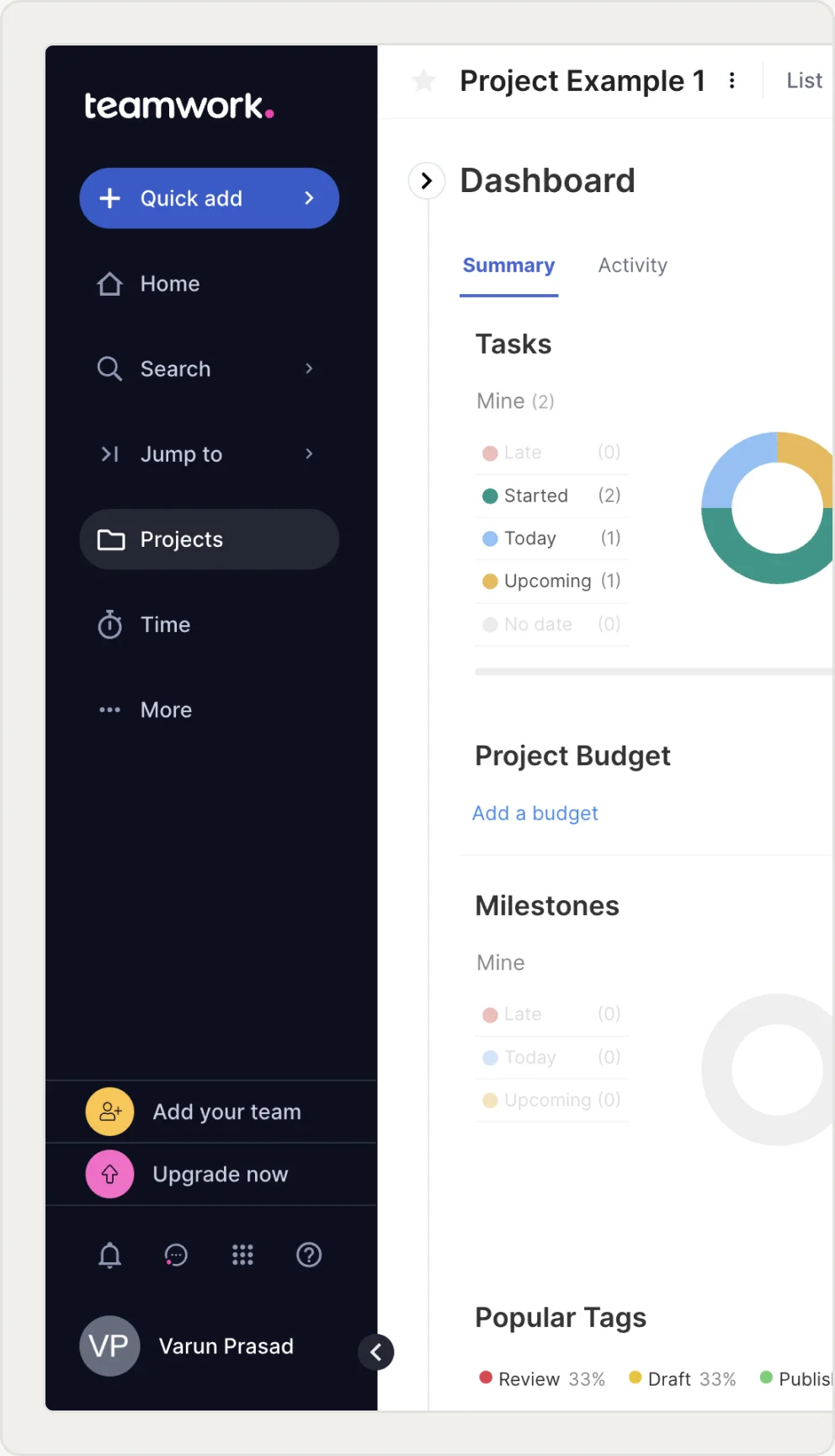
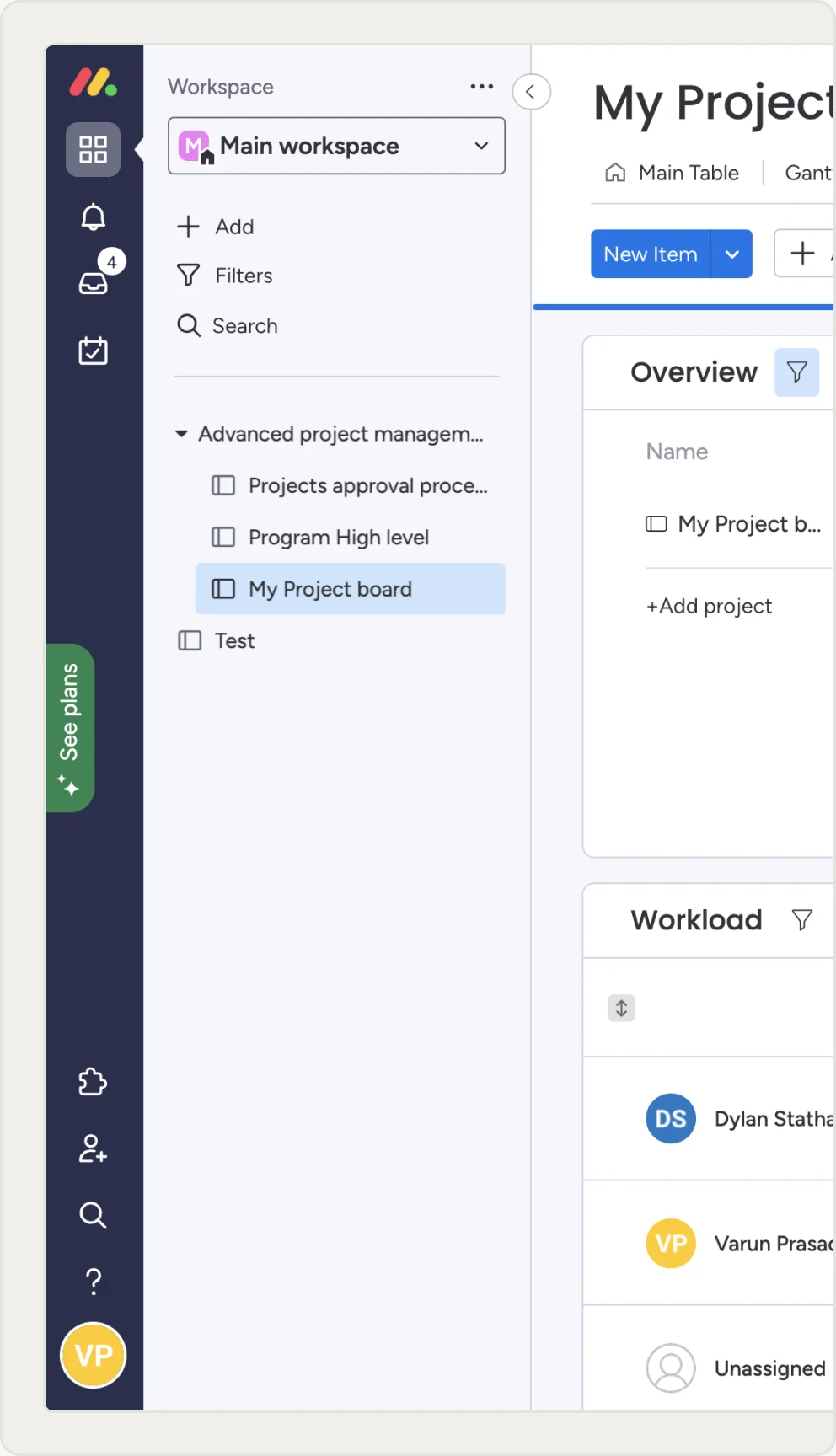
Scoro, Teamwork and Monday were benchmarked to see how each treated the dashboard as a landing screen. All three used modular, user-customisable widgets rather than a single fixed layout, confirming this was an established category expectation and setting the baseline the redesign needed to meet.
Scoping Workshop
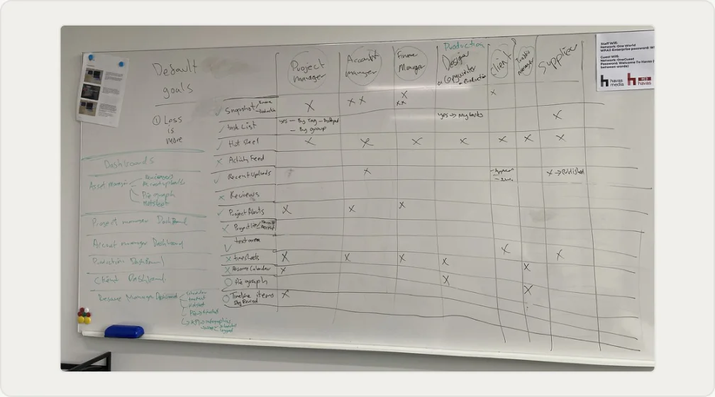
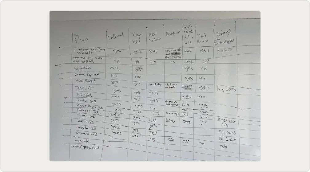
Deciding to Let Users Configure, Then Scoping the Work
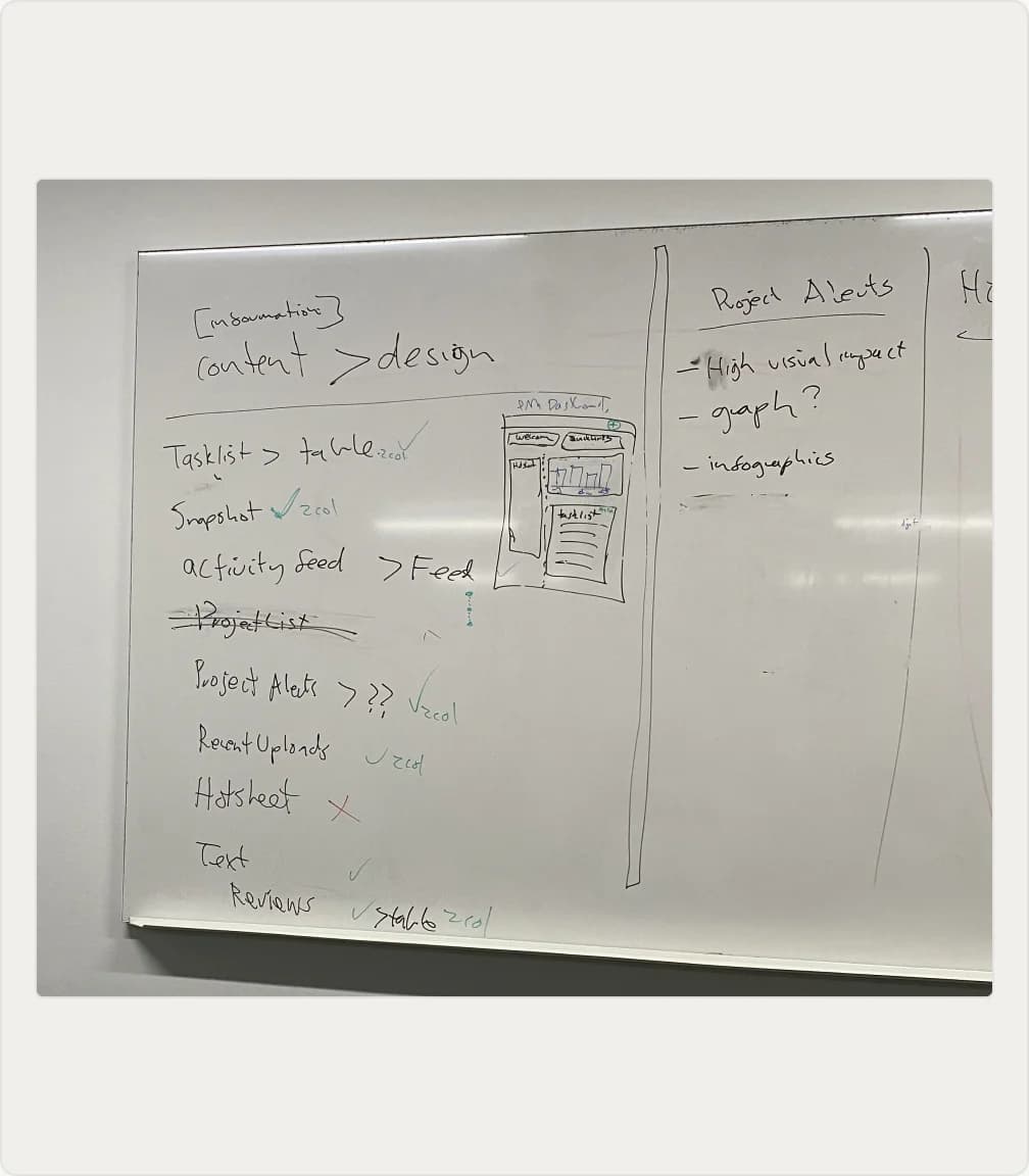
The core decision was to let users configure and reorder their own widgets rather than ship a smarter one-size default. From there we worked through every dashboard, widget and page, deciding what to keep as-is, rebuild or cut. Each item was scored against rebrand, top-nav and new-feature needs, then given a redevelopment timing.
Information Architecture
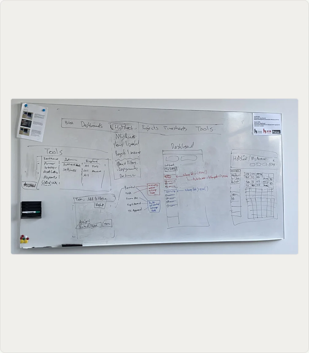
Mapping Structure Before Screens
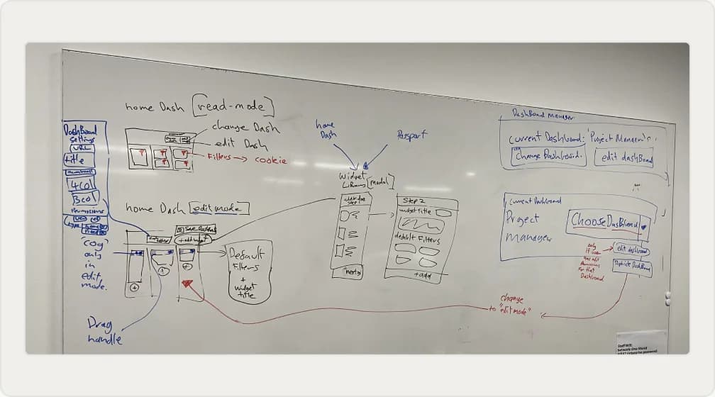
The IA work mapped the platform's navigation and the structure behind each dashboard, from the top-level nav down to individual widget placement. It also defined the dashboard edit flow, covering the widget library, drag-to-reorder, default filters and how users would switch between and customise their own dashboards.
Ideation & Concepting
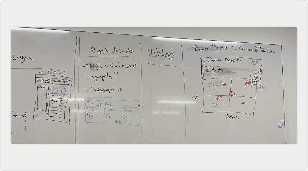
Sketching Dashboards for Every Role
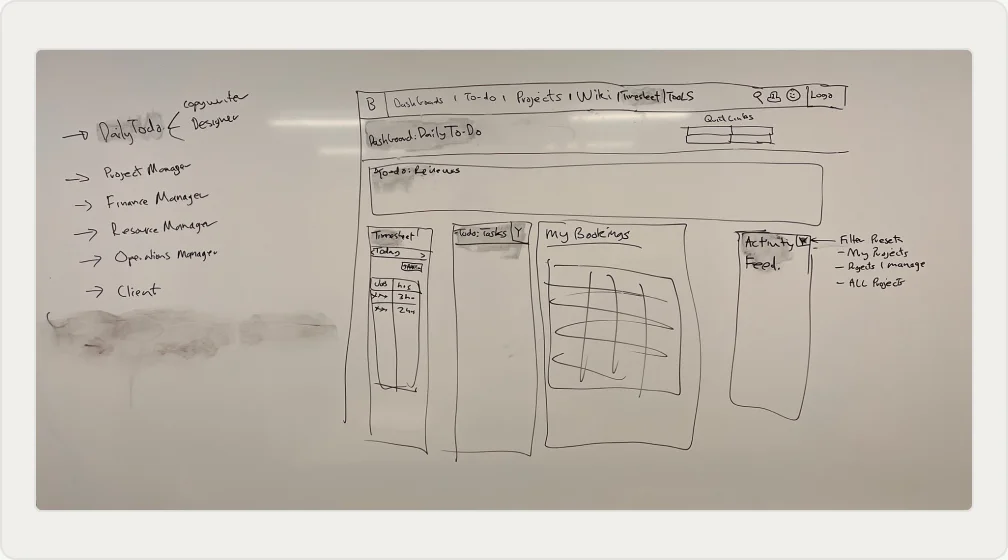
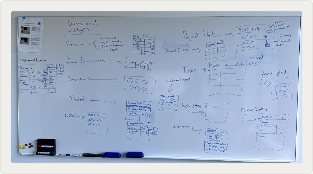
Low-fidelity wireframes explored how each dashboard would work for different roles, from Project Manager to Finance, Resource and Operations Managers through to clients. Sketching each layout by hand surfaced which widgets each role needed to see first, before committing any structure to high-fidelity design.
Early Prototyping
What Both Prototypes Got Right
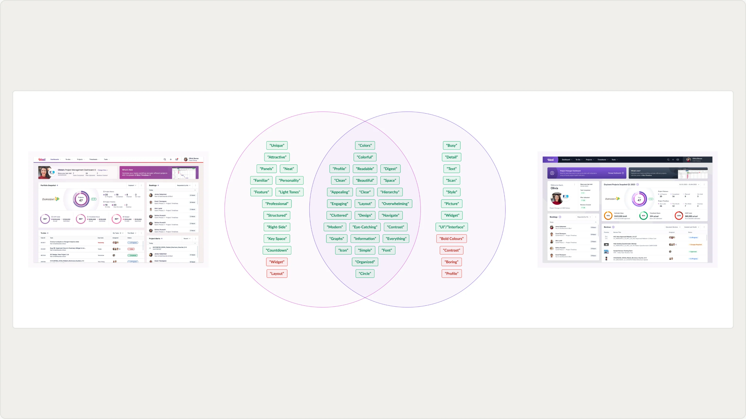
Two dashboard prototypes were tested on UsabilityHub, and the open feedback was coded into recurring positive and negative themes. A Venn diagram mapped which qualities were unique to each prototype and which overlapped. The shared positives, which were colour, clarity and readability, set the direction for the final design.
Page Layout
One Grid, Every Layout
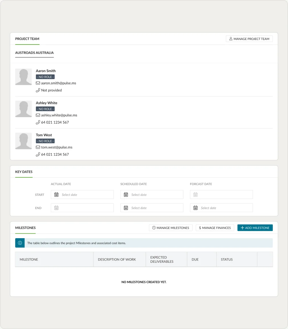
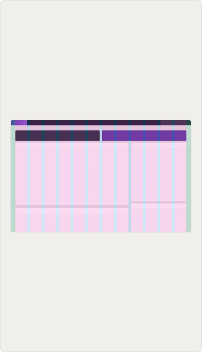
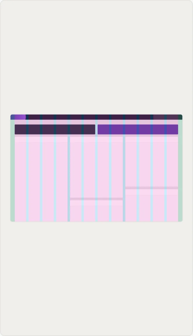
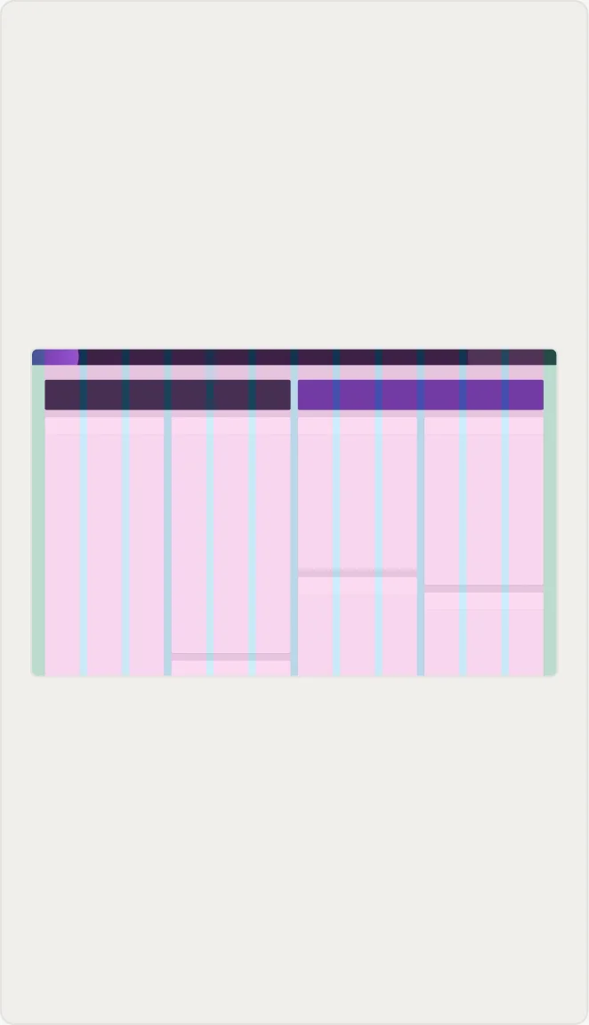
Every dashboard layout is built on the same foundational 12-column grid, so widget widths can range from a single column to full width while staying aligned to a shared structure. A single view can carry anywhere from one to four widgets across without breaking column alignment or needing a bespoke arrangement each time.
Widget Design
Designing Each Widget as Its Own Module
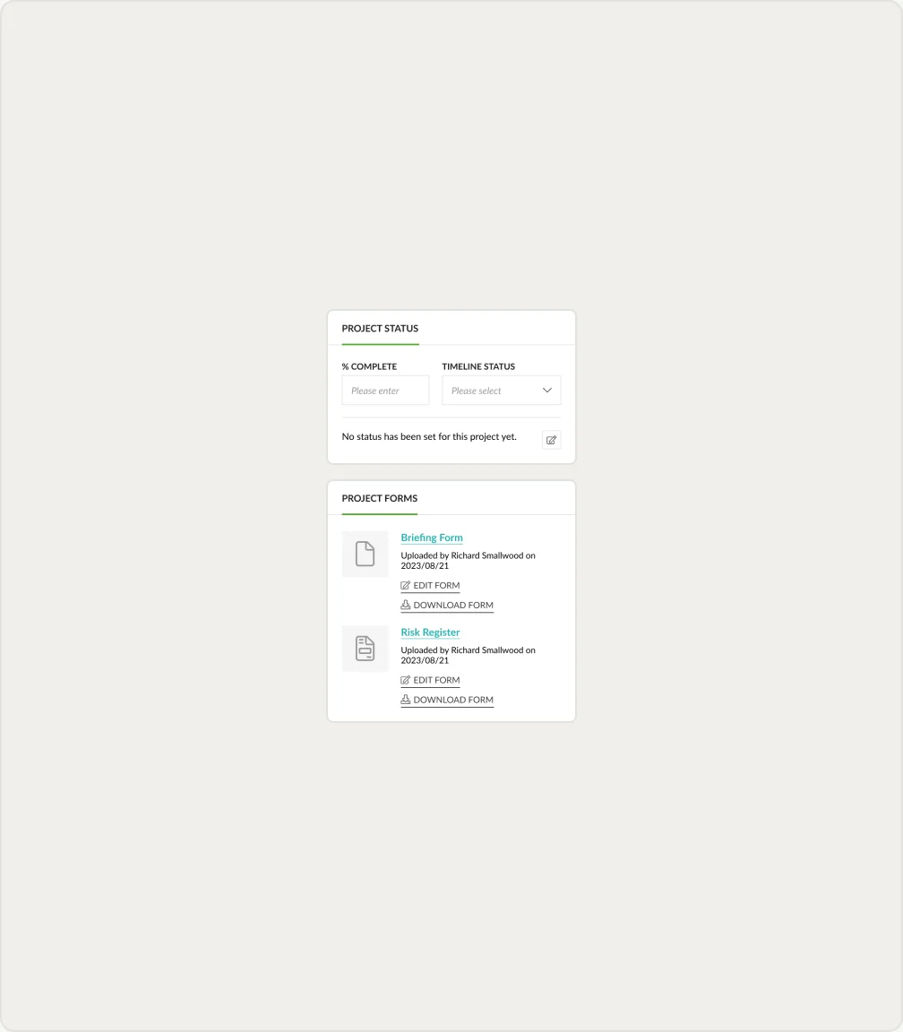
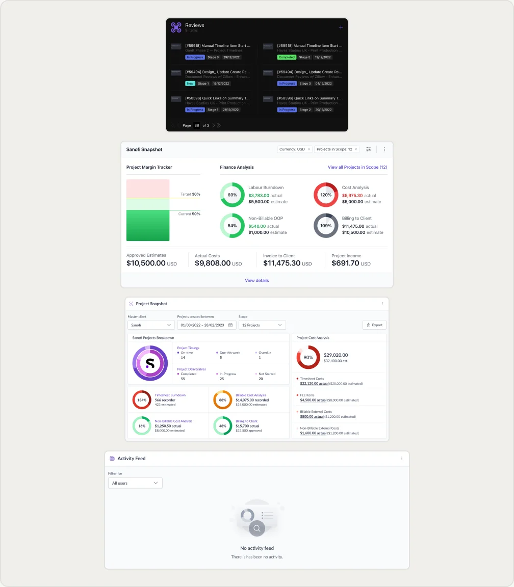
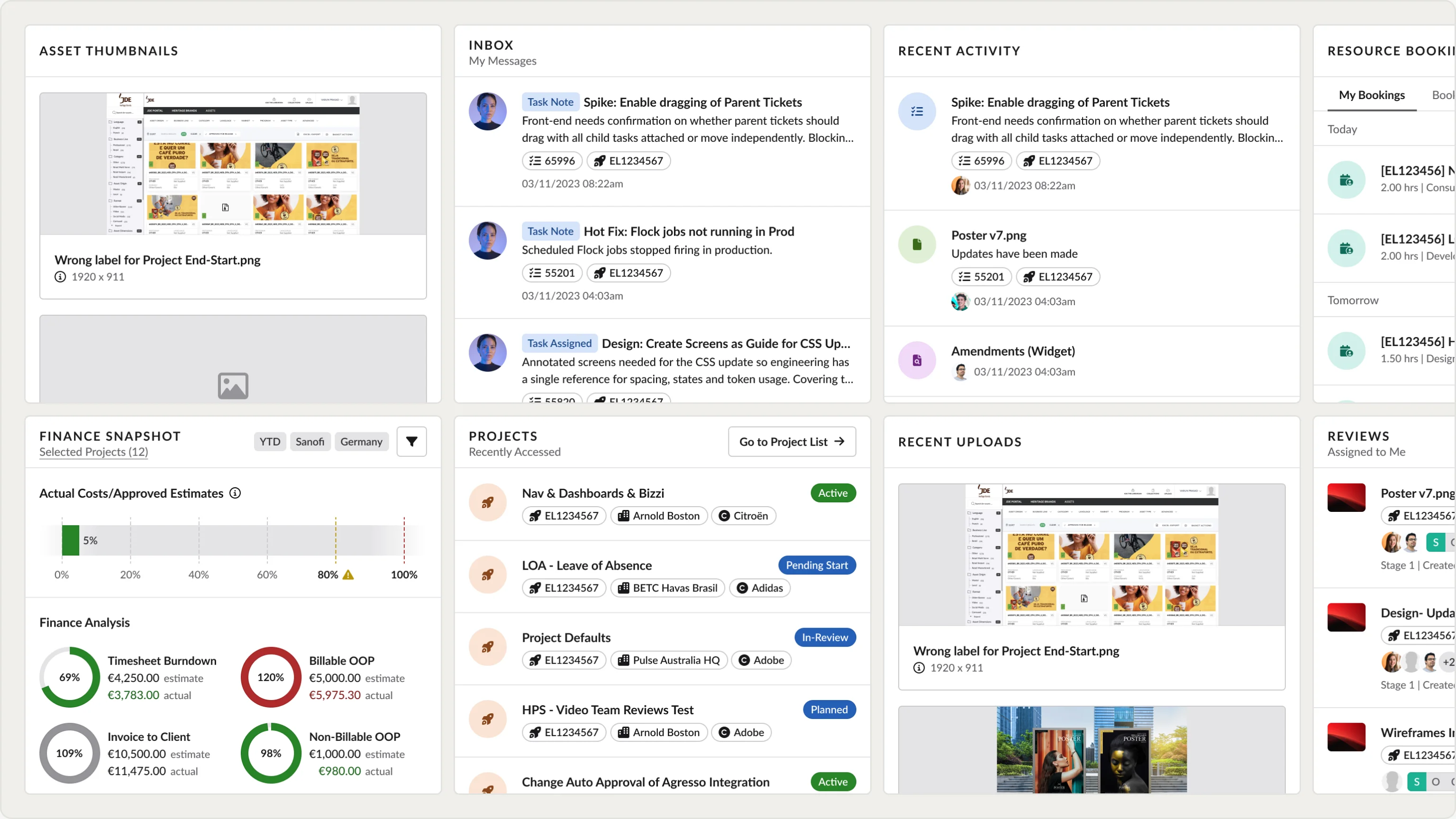
Each widget was designed as a self-contained module that could sit in any column position without breaking the shared layout. The set spanned finance widgets, resource widgets, reviews and tasks widgets, activity feeds and project alerts, each built to surface the most relevant information first for the role viewing it.
Dashboard Manager
How Users Build Their Own Dashboard
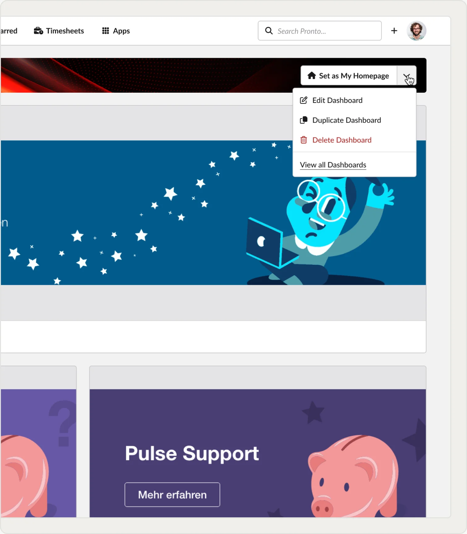
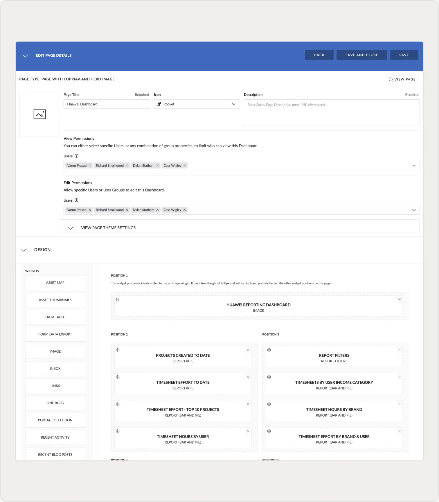
The Dashboard Manager is where the configuration decision becomes something users can act on. From the homepage they can set any dashboard as their own, duplicate or edit it, then drop widgets into fixed grid positions, reorder them and set view and edit permissions per user or group.
Outcome
From Static Landing Screen to Something Users Shaped
The dashboard moved from a single static layout to a modular system users could reorder and prioritise themselves, so the first screen after login reflected each user's role and usage rather than one generic arrangement. New layouts could be explored and shipped without a full design-to-handoff cycle for every variation.
↑52%
Active Dashboard Engagement
↑22%
Session Dwell Time
Learnings
1
Letting users set their own widget priority solved the generic-dashboard problem more directly than any single smarter default would have.
2
Designing each widget as a self-contained module meant new layout variations could be tested without rebuilding screens each time, which is what made the shift away from a fixed design-to-handoff cycle possible.
Future Planning
Using per-widget engagement data to inform smarter default arrangements for new users, so people start from a role-appropriate layout rather than the same blank template before they have usage history to personalise against.


